A comprehensive toolkit of volatility tools providing a snapshot of past and future readings for: volatility on a stock, its industry peers and some measure of the broad market.The Volatility Lab comprises three tabbed workspace snapshots for Implied Volatility, Historical Volatility and Industry Comparison.

To open the Volatility Lab
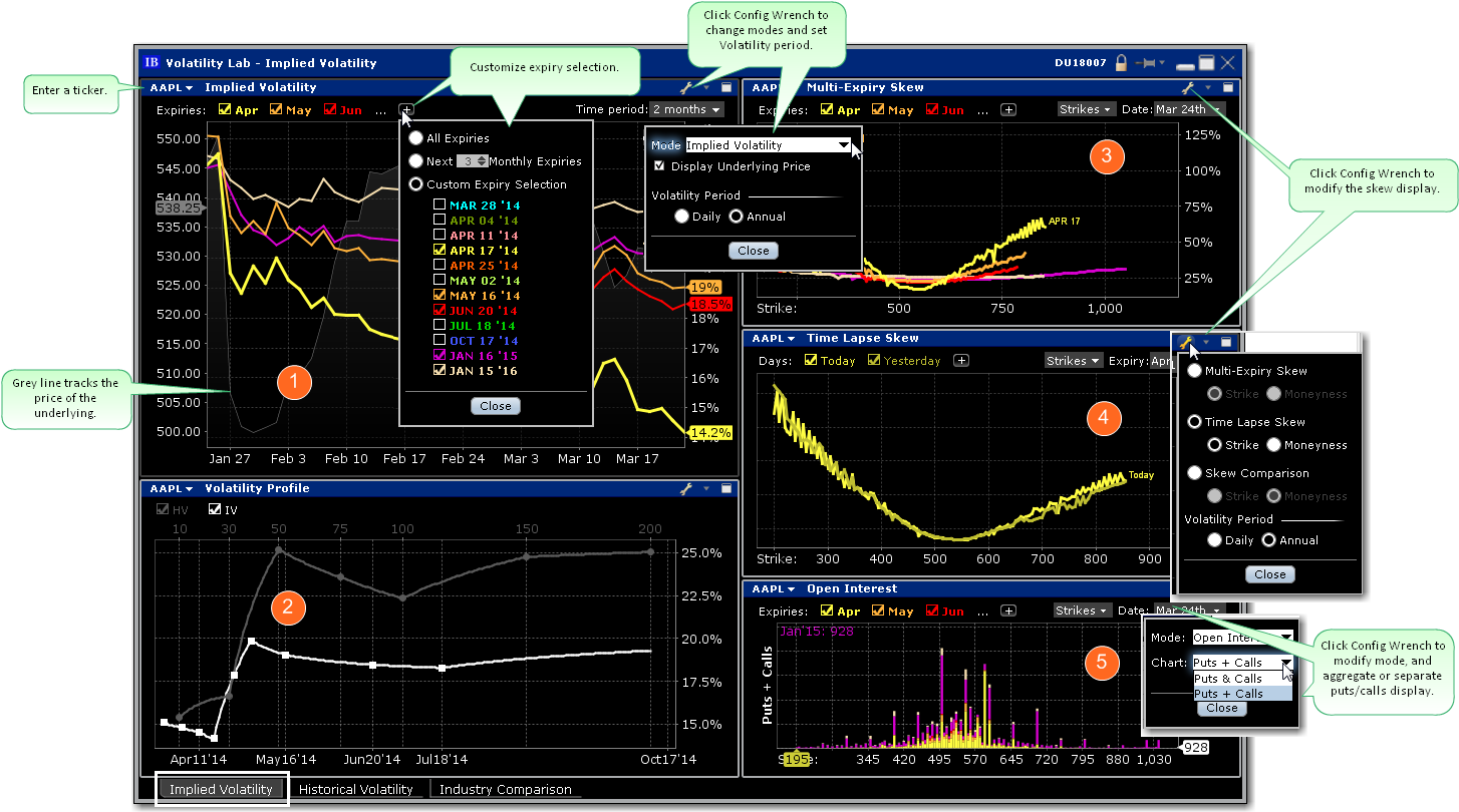
The Volatility Lab opens to the Implied Volatility layout by default. Move between layouts (Implied Volatility, Historical Volatility, Industry Comparison) using the tabset along the bottom frame. The Implied Volatility layout comprises five windows:
 Implied Volatility Window
This displays the measure of anticipated volatility of the stock using the prevailing option premium. The plot allows the user to display the IV reading for as many or as few of the available last trading days. Each is color-coded with the reading for implied volatility measured on the right axis and the stock price is traced using the grey line. This look-back view of IV can be plotted for 1 week, one, two and six months, one year or a custom period. The user may be able to immediately tell from the readings whether or not implied volatility is relatively high in any given month, possibly caused by expected earnings announcements or uncertainty over possible changes to dividend payments.
 Volatility Profile Window
Shows the Historical and Implied readings of volatility side-by-side, over time. Either measure can be removed from the screen by clicking on the checkbox. Compare actual stock volatility to the forward measure apparent through option premium, and gauge how far the two measures deviate over time in response to market shocks, or as the underlying share prices track higher or lower. The window allows the user to look back over a one-year period. Use the Configure Wrench icon to change modes. In the Volatility Profile window the default view compares historic and implied readings of volatility but the alternate mode, Volatility Profile Comparison, shows the readings of implied volatility on industry comparable stocks.
 Multi-Expiry Skew
Displays the “volatility smile” created by the premium paid for options at selected expirations. Because an option’s premium is significantly comprised of the reading of implied volatility, an option trader is concerned by the respective cost of calls and puts at strike prices above and below the prevailing price of the underlying shares. When investors are more willing to pay higher premiums for in-the-money calls or out-the-money puts, the volatility curve may show a skew to price points below the prevailing share price. Conversely if options are priced higher for out-of-the-money calls and in-the-money puts, the volatility curve might be skewed higher to points above the prevailing share price. Use the Configure Wrench icon to change between Multi-expiry Skew, Time Lapse Skew (described in #4 below) and Skew Comparison (which allows the user to view the skew on a specified expiration date for the ticker and its industry comparables, any of which can be unchecked above the plot. Because we could be viewing stocks or an index with hugely different prices, the x-axis defaults to Moneyness rather than any individual share price).
You change the display for Multi-expiry and Time Lapse skews to compare Moneyness or Strike. Moneyness is the position of the strike to the underlying, while the Strike option will display the actual set of available strike prices on the x-axis. Use the Custom Calendar drop-down menu in the upper right of the screen to drive the same view to any available prior date. The user can then compare how long a particular condition may have been in place. Note also that the display can be changed between Moneyness and Strike using the Configure Wrench icon.
 Time lapse Skew
An option trader may be interested in knowing how such a price skew has evolved. By using the Time Lapse Skew panel, the user can plot the current volatility skew for a selected expiration and compare to any prior period reading of one day, one, two and three weeks and one month ago. This allows investors to identify changing conditions in the option market or perhaps to identify a catalyst that caused skew to occur or disappear.
 Open Interest
view current or historic open interest for available contract months and strikes. Choose any available expiry and view the combined put and call reading of open interest. The plot can be restricted to specific strikes or will default to open interest across all strikes. Open interest measures investor enthusiasm for a particular stock and also identifies strikes where most or least liquidity might be available. Note also that in the upper right corner there is a calendar drop-down menu that allows the user to view open interest on chosen months or strikes from prior dates. Just pick the time period and select that date.
Use the Configure Wrench icon to change modes between Open Interest and Option Volume. The Chart allows the user to determine whether to see volume or open interest for Puts and Calls combined in one chart (Puts + Calls) or broken out into bull and bear contracts in two charts (Puts & Calls). Use the calendar dropdown to review activity or positioning from any prior calendar date.
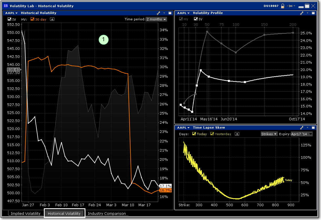
This tab comprises the Historical Volatility window, along with the Volatility Profile and Time Lapse Skew, both of which are described above (#2 and #4).

 Historical Volatility
This plot defaults to the 30-day reading of both implied and historical volatility plotted against the share price over a custom period. By clicking on the plus arrow the user can select from an array of calculations to view historical volatilities. Investors may want to see how high and for how long volatility measures rise or fall when they suffer significant swings driven by aberrations to the trend for the underlying share price. The grey line in the background plots the reading for the underlying share price.
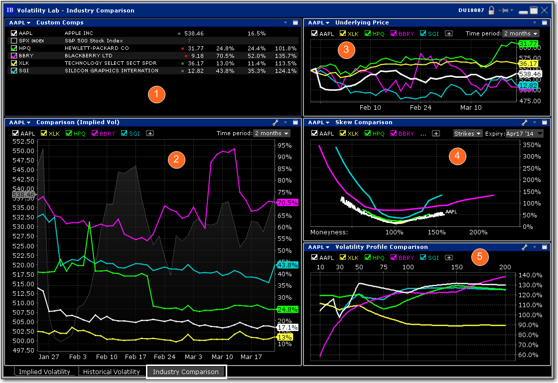
The five-window Industry Comparison workspace provides comparison of a stock’s volatility measures against those of comparable companies in the same industry group.

 Custom Comps
The company is grouped in the upper pane along with its competitors with a share price and volatility comparison. Check related companies to see their data reflected across all windows.
 Implied Volatility Comparison
The measure of volatility for each of the selected companies appears below in the Implied Volatility Comparison window along with the share price of the company under analysis, which is plotted as a gray line in the background. Click the "+" sign to add competitors or the comparison to the S&P 500 index. Note also that you can add a company that is not considered a competitor by TWS by entering its ticker symbol into either of the Custom input fields. This feature allows you to compare the implied volatility display on an industry against that of a stock in another field. The default time frame for this chart is two-months. Use the Time Period drop-down menu to choose from the available time frames to tailor the view. Use the Configure Wrench icon to change modes.
 Underlying Price
In addition to displaying volatility comparisons, this tab allows the user to compare the share price performance of the chosen underlying with its peer group, the S&P 500 index, and other custom-defined companies. Any tickers you may have entered in the Volatility Comparison plot will show up here, but these can be removed by deselecting them above the chart. Note also that the time period is configurable by selecting the drop-down menu in the upper right of the chart.
 Skew Comparison
This plot is discussed above.
 Volatility Profile Comparison
This plot is discussed above.